Building a Scalable Design System for an ERP Platform

Industry
E-Commerce
Service
Website
Role
UI/UX Designer
Date
3rd November, 2025
Rebranding an E-Commerce Experience Through UX Optimization
Industry
E-Commerce
Service
Website
Role
UI/UX Designer
Date
3rd November, 2025
Context
The ERP platform consisted of multiple modules that had evolved independently over time. As a result, the product suffered from inconsistent UI patterns, varying component styles, and duplicated design efforts. Buttons, form fields, tables, and navigation elements differed in size, spacing, and behavior across modules, creating a fragmented user experience and increasing development and QA effort.
Problem
The platform faced usability friction across key areas:
Component Inconsistency
Similar UI elements appeared differently across modules, creating a fragmented user experience
Fragmented Design Standards
The absence of standardized patterns led to inconsistent design and development decisions.
Scalability Challenges
Components were not built for reuse, resulting in frequent redesigns and maintenance efforts.
Inefficient Development & QA
Unclear component specifications increased implementation errors and validation time.
Visual Fragmentation
New features introduced additional inconsistencies, making it difficult to maintain a cohesive product experience.
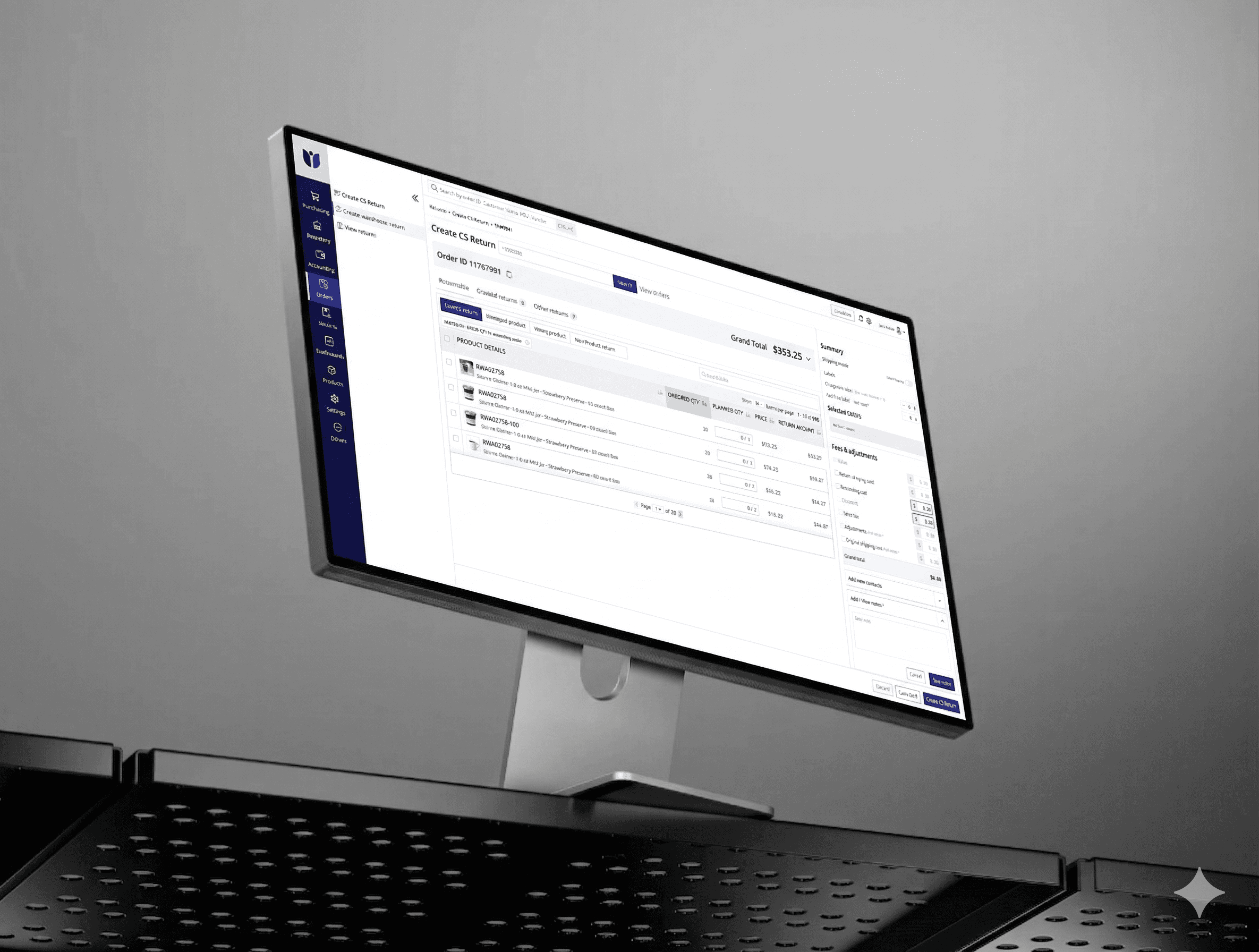
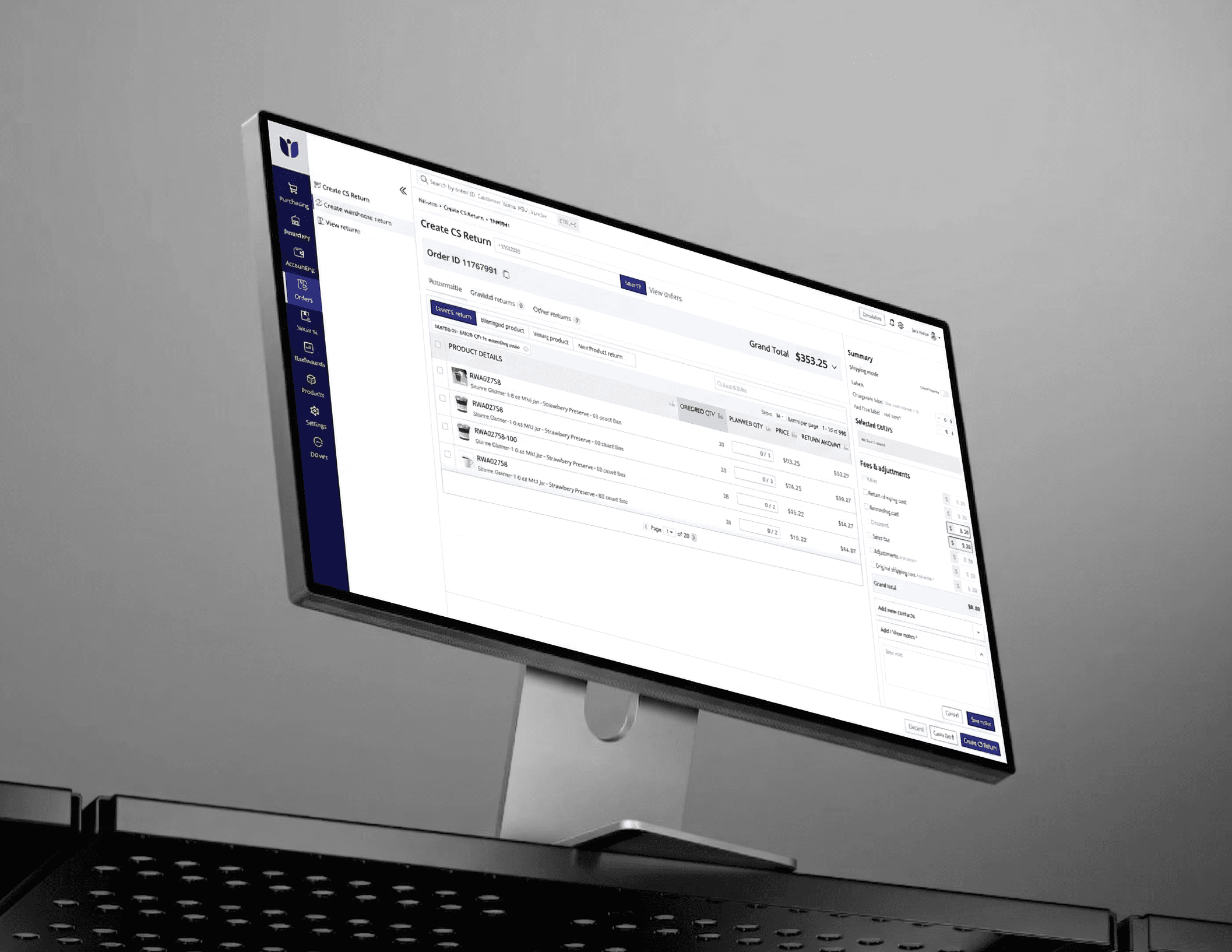
My Role
As the UI/UX Designer, I took ownership of auditing, structuring and maintaining the design system and integrating Storybook while collaborating closely with developers and QA teams.
Process
I conducted a comprehensive UI audit across ERP modules to identify inconsistencies and redundant patterns. Based on the findings, I established a unified design system consisting of reusable components, design tokens, spacing guidelines, typography standards, color variables, and interaction patterns.
To ensure seamless adoption, I worked closely with developers to map Figma components to Storybook implementations. Each component was documented with variants, states, usage guidelines, and behavior specifications, creating a single source of truth for design and development.
Impact
Improved consistency across all ERP modules.
Reduced repetitive design and development efforts.
Accelerated feature implementation through reusable components.
Enabled QA teams to validate UI against Storybook references.
Maintained and scaled the design system to support new modules while ensuring consistency and faster delivery.

Solution
Brand System
Introduced a calmer and more refined visual language using cleaner hierarchy, natural tones, and editorial-style presentation to better communicate sustainability and premium quality.
Design System
Improved consistency by standardizing components, spacing, typography, and interaction patterns across the platform.
Product Listing Optimization
Enhanced product cards and listing layouts to improve:
Scanability
Product comparison
Information prioritization
Trust visibility
Checkout Improvements
Focused on reducing uncertainty through:
Clearer pricing visibility
Better progress communication
Stronger CTA hierarchy

Rebranding an E-Commerce Experience Through UX Optimization

Context
The project was initiated as a strategic rebranding and UX optimization effort for an e-commerce platform focused on restaurant grade sustainable packaging products. The existing experience no longer reflected the company’s positioning around craftsmanship, sustainability, and premium quality. Beyond visual inconsistency, the platform introduced usability friction across critical commerce journeys including product discovery, product evaluation, and checkout completion.
Problem
The platform faced usability friction across key areas:
Listing Page Drop-offs
Product listings lacked scanability, making comparison and decision-making difficult. Important details like sustainability indicators, pricing, and differentiation were visually diluted.
Checkout Friction
Unexpected costs, unclear progress visibility, and low trust reinforcement created uncertainty during checkout, increasing abandonment risk..
Inconsistent Design System
Inconsistent spacing, typography, and component behavior reduced predictability and weakened overall usability.
Poor Product Discovery
Users struggled with navigation, filtering, and identifying relevant products due to weak hierarchy and unclear information architecture.
Insight
Reducing cognitive load
Improving scanability
Increasing consistency
Reinforcing trust through UX
The biggest issue wasn’t lack of content or functionality—it was lack of clarity and guidance.
Users were exposed to information, but the interface failed to intentionally guide attention and decision-making. Additionally, the brand’s positioning around sustainability and craftsmanship was not reflected in the digital experience. This shifted the redesign approach toward:
Iteration
Design decisions evolved based on how effectively users could navigate and compare products with minimal effort.
Information density
Usability clarity
Faster decision-making
Visual consistency
Multiple layout and hierarchy explorations were tested to balance:
Solution
Design System
Improved consistency by standardizing components, spacing, typography, and interaction patterns across the platform.
Product Listing Optimization
Enhanced product cards and listing layouts to improve:
Scanability
Product comparison
Information prioritization
Trust visibility
Checkout Improvements
Focused on reducing uncertainty through:
Clearer pricing visibility
Better progress communication
Stronger CTA hierarchy
Brand System
Introduced a calmer and more refined visual language using cleaner hierarchy, natural tones, and editorial-style presentation to better communicate sustainability and premium quality.
Industry
E-Commerce
Service
Website
Role
UI/UX Designer
Date
3rd November, 2025
Key Decisions
Prioritized conversion-critical friction points first
Designed listing pages for faster visual scanning
Reduced cognitive load through clearer hierarchy
Improved predictability through systemic consistency
Reinforced sustainability and craftsmanship through interface design
Outcome
Improved product discoverability
Better listing engagement
Reduced interaction ambiguity
Stronger checkout confidence
Improved design consistency across the platform
Design decisions evolved based on how effectively users could navigate and compare products with minimal effort.
The redesign transformed the platform into a more scalable, trust-oriented, and user-friendly commerce experience. Expected impact areas included:
Information Architecture

Final Design
Usability consistency
Product evaluation efficiency
Trust communication
Overall shopping clarity
Design decisions evolved based on how effectively users could navigate and compare products with minimal effort.
The final experience created a cleaner, more structured, and brand-aligned interface that improved:
Collaborated with project manager and developers to align business and user goals
Conducted UX audits and identified key friction points
Defined design system foundations (typography, color, components)
Delivered high-fidelity UI and interaction patterns
Product listing page (PLP)
Guided
Homepage redesign
Co-created
Component library with developers
Owned
Product detail page (PDP)
Owned
Iterative usability improvements
Co-created
Checkout experience improvements
Co-created
Design system
Owned
Experience name
Role
Ownership
Redesign Changes
The redesign improved both user experience and business performance, making the platform easier to use and more conversion-friendly.


Conversion improvements
Before
8%
After
8%
Product search duration
Before
65%
After
80%
Drop offs on listing pages
Before
55%
After
42%
Cart abandonment
Before
45%
After
22%