A brief about who we built it for
Restaurantware is a global manufacturer and supplier of food-service products, supported by an internal ERP ecosystem that manages products, inventory, vendors, purchasing, returns, logistics, and other business operations.
As part of the Product Design team, I worked on redesigning and scaling the ERP platform while establishing a unified Design System that became the foundation for every new module.
A brief about who we built it for
Restaurantware is a global manufacturer and supplier of food-service products, supported by an internal ERP ecosystem that manages products, inventory, vendors, purchasing, returns, logistics, and other business operations.
As part of the Product Design team, I worked on redesigning and scaling the ERP platform while establishing a unified Design System that became the foundation for every new module.
Chaos before establishing RW 3.0
A brief about who we built it for
Restaurantware is a global manufacturer and supplier of food-service products, supported by an internal ERP ecosystem that manages products, inventory, vendors, purchasing, returns, logistics, and other business operations.
As part of the Product Design team, I worked on redesigning and scaling the ERP platform while establishing a unified Design System that became the foundation for every new module.
When I joined the team, several ERP modules had already been migrated to a newer UI. Although visually improved, every module had evolved independently.
This created inconsistencies across both design and development, making the product increasingly difficult to maintain.
What we observed
Different developers built the same UI components differently.
Similar interactions behaved differently across modules.
No shared spacing, typography or color standards.
Components lacked reusability.
QA repeatedly found UI inconsistencies.
Design handoff varied from designer to designer.
Chaos before establishing RW 3.0
When I joined the team, several ERP modules had already been migrated to a newer UI. Although visually improved, every module had evolved independently.
This created inconsistencies across both design and development, making the product increasingly difficult to maintain.
What we observed
Different developers built the same UI components differently.
Similar interactions behaved differently across modules.
No shared spacing, typography or color standards.
Components lacked reusability.
QA repeatedly found UI inconsistencies.
Design handoff varied from designer to designer.
Create a scalable Design System that could become the single source of truth for both designers and developers.
The objectives were:
Different developers built the same UI components differently.
Similar interactions behaved differently across modules.
No shared spacing, typography or color standards.
Components lacked reusability.
QA repeatedly found UI inconsistencies.
Process
To address the unique needs of Restaurantware's ERP platform, we created a design system process tailored to its workflows and scale. The first step was a detailed interface audit to surface inconsistencies, establish priorities, and define the components with the greatest impact.
Create a scalable Design System that could become the single source of truth for both designers and developers.
Building RW Design System 3.0
Every scalable system begins with the base:
Different developers built the same UI components differently.
Similar interactions behaved differently across modules.
No shared spacing, typography or color standards.
Components lacked reusability.
QA repeatedly found UI inconsistencies.
Different developers built the same UI components differently.
Similar interactions behaved differently across modules.
No shared spacing, typography or color standards.
Components lacked reusability.
QA repeatedly found UI inconsistencies.
Colors
Icons
Typography
Radius
Shadow
Process
To address the unique needs of Restaurantware's ERP platform, we created a design system process tailored to its workflows and scale. The first step was a detailed interface audit to surface inconsistencies, establish priorities, and define the components with the greatest impact.
Building RW Design System 3.0
Every scalable system begins with the base:
Colors
Icons
Typography
Radius
Shadow
COLORS
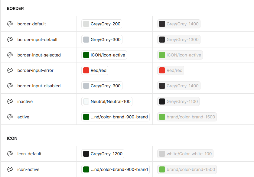
The interface used inconsistent colors, making it feel cluttered and harder to maintain. I created a unified color system aligned with the brand, with support for both light and dark themes.
ICONS
Finding icons with a consistent stroke and style in ERP systems was challenging. So I carefully curated each icon to create a clean, lightweight, and cohesive experience that makes navigation more intuitive and clear.
TYPOGRAPHY
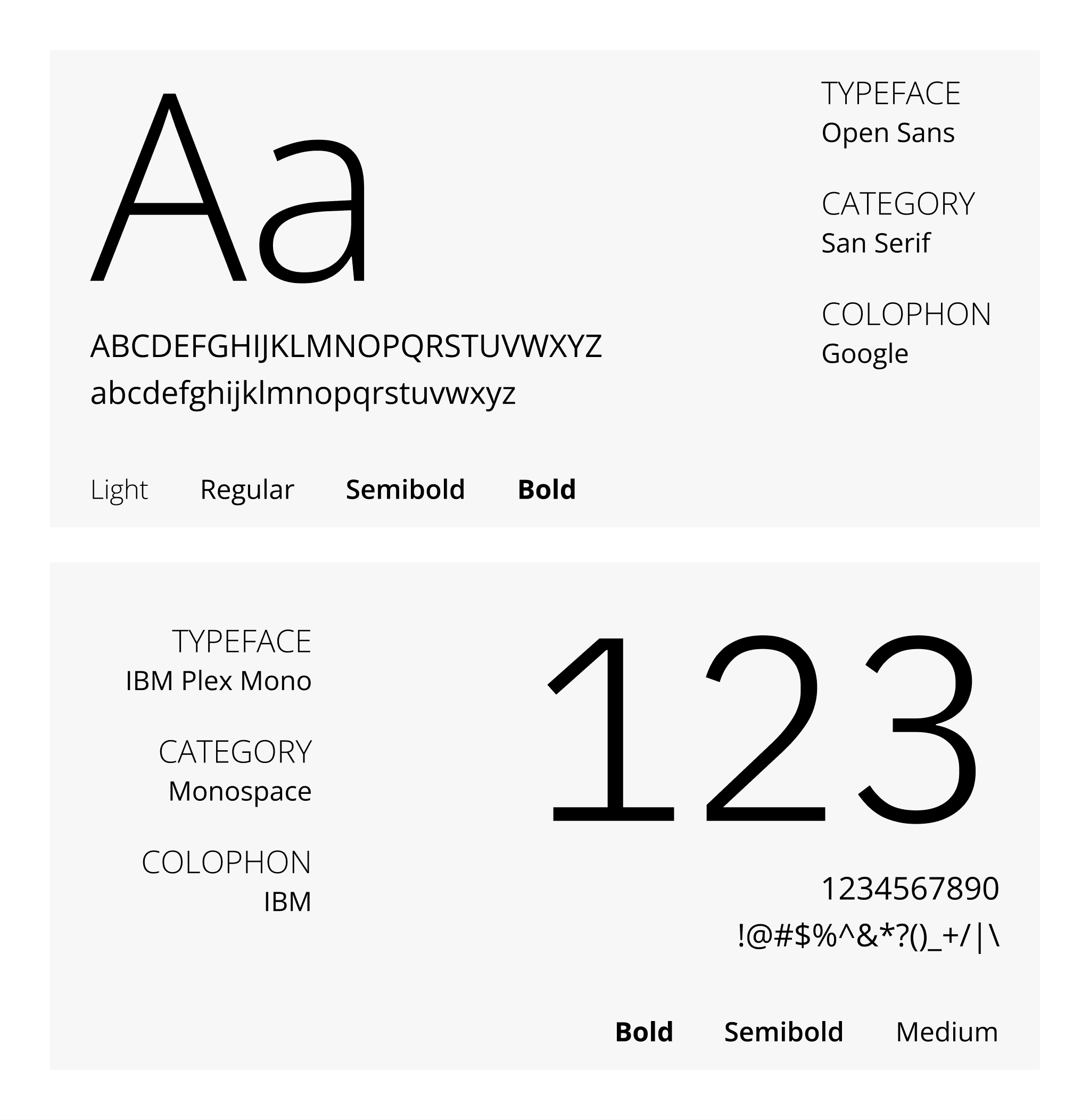
Typography was inconsistent, making the interface harder to scan. I introduced a clear type system with defined hierarchy, improving readability and creating a more cohesive experience.
RADIUS
Corner radius shapes how a product feels. We defined consistent radius values that reflect RW's trustworthy and approachable identity while keeping every component visually cohesive.
SHADOW
Corner radius shapes how a product feels. We defined consistent radius values that reflect RW's trustworthy and approachable identity while keeping every component visually cohesive.
Three-Tier token system
As RW's platform grew, maintaining design consistency became more complex. To support scalable theming, component flexibility, and a clearer design-to-development workflow, we adopted a three-tier token system
Primitive
Semantic
Component based
What changed after the implementation
The design system enabled Module Migrations within 1 month average time, cut production time by 70%, and improved design efficiency by 3×—bringing greater speed, scalability, and consistency across the product.